For a few days, the Seattle Storm’s social media accounts were teasing that “The Storm is Coming,” in preparation for an announcement on March 2nd.
When the Storm’s online team shop was also closed until that very day, that likely led everyone to believe that Seattle was about to debut a new insignia.
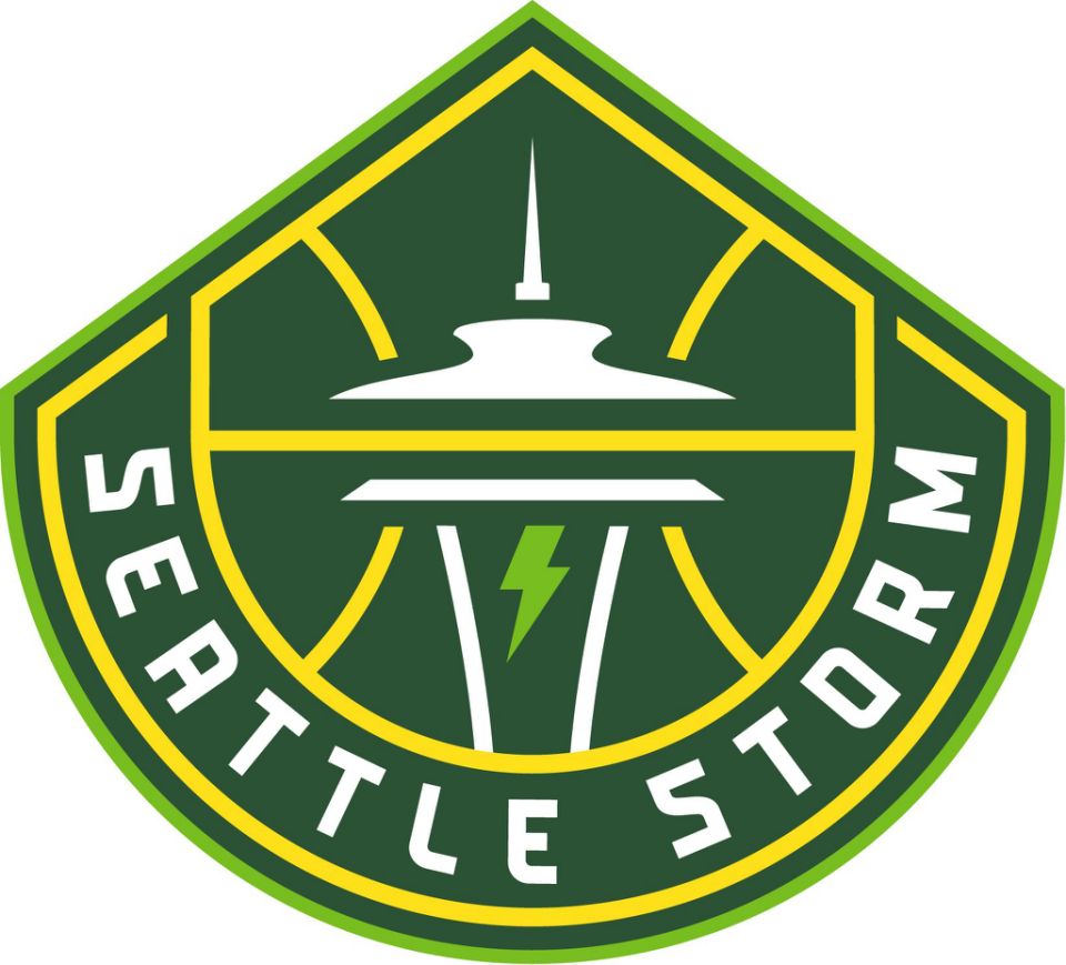
Lo and behold, the Storm did just that – a new logo that keeps its green and gold colors and also adds an additional, lighter shade of green (described as Bolt Green in the team’s official release).
A small lightning bolt (also in Bolt Green) also adorns the center of the insignia and the Bolt Green also outlines the new look’s perimeter.
#TakeCover⚡ The Storm is Coming.https://t.co/INw22sb32W pic.twitter.com/Lj7siuuzOU
— Seattle Storm (@seattlestorm) March 2, 2021
⛈️ A force to be reckoned with.⛈️#TakeCover⚡ pic.twitter.com/qf5r237d70
— Seattle Storm (@seattlestorm) March 2, 2021
Be the first to rep our new gear. 💧🔥https://t.co/rrH7YZzeyQ#TakeCover⚡ pic.twitter.com/1xP8qs6v3q
— Seattle Storm (@seattlestorm) March 2, 2021
💎⚡The weather-hardened crown jewel of the Pacific Northwest.⚡💎#TakeCover⚡ pic.twitter.com/mlWejjEU44
— Seattle Storm (@seattlestorm) March 2, 2021
Hoops is in our blood. Always has been, always will be. 🏀😤#TakeCover⚡ pic.twitter.com/SUBvrZi1wZ
— Seattle Storm (@seattlestorm) March 2, 2021
Intensity, Power, and Purpose. 😤#TakeCover⚡ pic.twitter.com/LM8L9cSsul
— Seattle Storm (@seattlestorm) March 2, 2021
Per a release, the new look retains the Space Needle’s image, but also adds that of Mount Rainer.
Sue Bird and Jordin Canada will, in vintage Seattle fashion, raise a flag atop the Space Needle on March 3rd that features the Storm’s new look. As of this writing, the Storm’s website has yet to be updated with the new logo (in seemingly vintage W website fashion, unfortunately).
The Storm have become the latest WNBA team whose logo has undergone a rebrand. In recent years, the Minnesota Lynx, Chicago Sky, New York Liberty, Atlanta Dream and, most recently, the Connecticut Sun have all updated its logos to insignias considered more “edgy.”
So….Phoenix Mercury? Washington Mystics? Indiana Fever? You up next?
Artists Mari Shibuya and Zahyr will have a mural installed on the Toulouse Petit building near Climate Pledge Arena that celebrates the Storm’s new identity as well as its commitment to social justice issues.
The Storm’s hockey roommates at Climate Pledge Arena, the Seattle Kraken, approved.
🤝
🔥 logos
#TakeCover pic.twitter.com/lltT4FxcVa— Seattle Kraken (@SeattleKraken) March 2, 2021