At first, when we saw what the 25th anniversary jerseys were to look like for many of the WNBA’s teams, the collective response – such as was with the Washington Mystics and Dallas Wings was – what are they doing?
Then, the real things were revealed – and what it turned out the WNBA was doing was THAT.
Introducing the new #WNBA @nikebasketball game uniform editions. pic.twitter.com/gSYB6dYaMz
— WNBA (@WNBA) April 8, 2021
April 8 was a day that many a WNBA fan was waiting for as it was the day that has been teased for a while as when the updated jerseys for all 12 teams would be released. The new looks received mostly rave reviews on social media with plenty of comments even believing that these jerseys are better than those of the NBA.
FIRST LOOK: All 12 #WNBA teams will wear new Nike-designed uniforms for the 25th Anniversary season.
Player Numbers will return on the front.
Each team will have 3 jersey editions:
– “Explorer” (team color)
– “Rebel” (female empowerment storytelling)
– “Heroine” (home white) pic.twitter.com/4HdNWTt1Sj— Nick DePaula (@NickDePaula) April 8, 2021
A big part of why these jerseys look so fresh was player input on what they should look like. Three designs for jerseys were released – Heroine (home white), Explorer (team color) and Rebel (a third style which conveys either a backstory or woman empowerment).
H.E.R. Hmmm….
First, let us say that team name and numbers have returned to the fronts of our jerseys for our WNBA teams. That is a major plus. As much as we rocked with the previous styles, those uniforms did give NASCAR vibes with the sponsor placements.
Second – the home white jerseys. Enough said.
What is a jersey release … without a jersey review? So, we will get to those without further adieu (of course we are poets and we always will know it).
Connecticut Sun
The details tell our story. Introducing the Heroine Edition. pic.twitter.com/5hoJxbIZ9u
— Connecticut Sun (@ConnecticutSun) April 8, 2021
The details tell our story. Introducing the Explorer Edition. pic.twitter.com/nhvDlewM1b
— Connecticut Sun (@ConnecticutSun) April 8, 2021
Bold. Authentic. Unapologetic. pic.twitter.com/WIHDeHKGCg
— Connecticut Sun (@ConnecticutSun) April 8, 2021
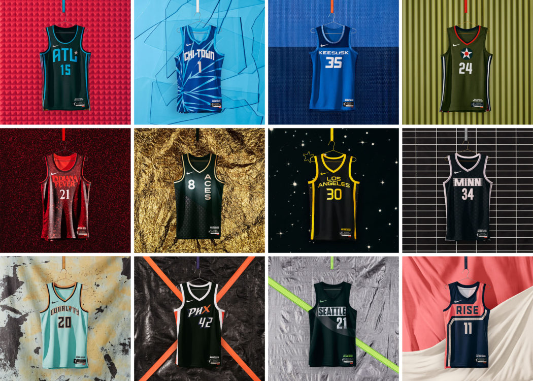
From afar, it may appear that the Connecticut Sun went back to basics with its jersey releases, but one has to look really good at the details to see where the Sun’s look stands out. The three jerseys certainly fall in line with Connecticut’s updated logo it released earlier this offseason, putting emphasis on its signature colors of orange, blue and white.
The Rebel edition stands out here because of the “Keesusk” on the front. “Keesusk” translates to “Sun” in the native language of the Mohegan Tribe. All three jerseys are also outlined with symbolic homages to the Mohegan Tribe and the fact that the Sun are the first-ever Native American-owned professional sports franchise.
New York Liberty
We put on for our city. #OwntheCrown🗽👑@Nike @HSpecialSurgery #NikeWomen pic.twitter.com/35YX4G2sab
— New York Liberty (@nyliberty) April 8, 2021
Similar to the Sun, it may appear that the Liberty also took a rather pedestrian (something New York is famous for) approach to its jerseys, except its approach could be seen as short, simple and to the point – as New Yorkers prefer. But where its stand out also is in its details.
All three jerseys feature copper – a color the Lib added to its signature black and seafoam green for its 25th anniversary. The seafoam Rebel edition (one of those spotted at a Dick’s Sporting Goods) include “Equality” across the front of its jersey. And there are “speckled details” on the Explorer edition that denote New York’s status as a concrete jungle.
Washington Mystics
Powerful. Enduring. Disrupting. Undeniable.
These are our Heroine and Explorer uniforms >> https://t.co/FIdZ6EBsCq#DistrictOfChange pic.twitter.com/sbevB8Ivgv
— Washington Mystics (@WashMystics) April 8, 2021
Rise for change with us.
Sign up to be one of the first to buy your REBEL EDITION jersey >> https://t.co/77mhor96F9#DistrictOfChange | #RiseAsOne pic.twitter.com/Q5NvrZSeiU
— Washington Mystics (@WashMystics) April 8, 2021
The nation’s capital’s WNBA team is the first team here with a Rebel Edition jersey that explicitly pops upon first glance. It, as well, was one of those that initially got out via a leak at a Dick’s and got lots of attention for one of them misspelling Elena Delle Donne’s last name by including a hyphen.
The Heroine and Explorer unis are as expected for the American-flag colored Washington. Their Rebel jersey apparently was a part of a partnership between the team, Nike and the Women’s March, which make sense when one looks at the colors. It features the word “Rise” – an ode to D.C’s ability to rise against injustice as well as the words of the 19th Amendment that gave (white) women voting rights. Some criticized it because the amendment did not include Black women. Interestingly enough, the Heroine jersey also includes a star at the top of it which denotes D.C.’s fight for statehood.
Indiana Fever
a new era of Indiana Fever basketball.
introducing H.E.R. story 🔥
» https://t.co/0moaUCXeo4 pic.twitter.com/XMYLu6ycGy
— Indiana Fever ⛹️♀️🏀 (@IndianaFever) April 8, 2021
With Indiana’s basketball history, one may have expected a Rebel Edition for the Fever to resemble something from Hoosiers. Instead, Indiana decided to go a bit more modern and meta with its Rebel launch.
For its Explorer, it went navy blue instead of gold (another team did something similar) and for its Rebel Edition, it decided to use it as an ode to the Netflix “Stranger Things” series, which takes place in a fictional town in the Hoosier State. Unique to say the least. Indiana was actually a team where none of its looks was the subject of a jersey reveal prior to April 8.
Chicago Sky
Introducing our @WNBA Nike Heroine, Explorer, and Rebel Edition jerseys for the 2021 season. ⚪️⚫️🔵 pic.twitter.com/Y7T01x9IYJ
— Chicago Sky (@chicagosky) April 8, 2021
When you are the team that made the biggest free agent splash this offseason and you play in a big market, one has to go big for a much-ballyhooed jersey release such as this. And the Windy City’s WNBA team went bold and big for its 25th anniversary wear.
Interestingly enough, it was the Sky’s Explorer Edition instead of its Rebel that was revealed prior to the big day, and it is the pinstripes on both the Explorer and the Heroine that really became a hit among many in the WNBA family. But the Rebel is pure Chicago – the “Chi-Town” wording on the front with the Chicago Star, the light blue which is an ode to its cold, wintry climate and how it represents women’s ability to break glass ceilings. Pure Chicago.
Minnesota Lynx
Introducing…
𝓣𝓱𝓮 𝓗𝓮𝓻𝓸𝓲𝓷𝓮 𝓔𝓭𝓲𝓽𝓲𝓸𝓷 pic.twitter.com/uXoBFe9Bsu
— Minnesota Lynx (@minnesotalynx) April 8, 2021
𝕋𝕙𝕖 𝔼𝕩𝕡𝕝𝕠𝕣𝕖𝕣 𝔼𝕕𝕚𝕥𝕚𝕠𝕟 pic.twitter.com/2kgIJ8r9HA
— Minnesota Lynx (@minnesotalynx) April 8, 2021
𝙏𝙝𝙚 𝙍𝙚𝙗𝙚𝙡 𝙀𝙙𝙞𝙩𝙞𝙤𝙣 pic.twitter.com/Aj2ZfewLMr
— Minnesota Lynx (@minnesotalynx) April 8, 2021
As was the case with the Sun and Liberty reveals, one really has to peer deep at the details of the Lynx’s jersey reveals to find the vibe Minnesota was going in with its.
Its Heroine and Explorer fits are, to no surprise, very Timberwolves-esque and said Heroine will be a hit with fans given the Lynx are another team that once wore (and won championships) in those white uniforms. And, similar to the Sky, it was those two jerseys that were leaked prior to its Rebel release (which Nike says is an homage to one of the longest-running indie music venues in the US). The spotted details on its Explorer plus the stars on the all-black rebel (north stars, perhaps?) are without question what stand out here.
Atlanta Dream
Inspired by our city and brought to life by our athletes.
Meet our new @Nike Heroine, Explorer and Rebel jerseys. Making their debut this summer in the 🅰️#GoDream
— Atlanta Dream (@AtlantaDream) April 8, 2021
Given the city they play in and the political ordeal of the Atlanta Dream over the course of the past year, Georgia’s resident W team was expected to go heavy on the social justice message that denotes its 25th anniversary team and it did.
It features, say the Dream, 16 rays of the Atlanta-based National Center for Civil and Human Rights’ Pentagram mural which fuses together its rights movements. Its Explorer features red – the signature color of Atlanta’s sports teams. The Dream went mostly black with its Rebel release by incorporating the vibrancy of its city’s culture and an homage to its hip-hop scene – a longstanding staple of ATL culture.
Dallas Wings
𝐍𝐄𝐖 𝐄𝐑𝐀.
𝐍𝐄𝐖 𝐓𝐇𝐑𝐄𝐀𝐃𝐒.
Behold our #Nike Heroine, Explorer and Rebel uniforms for 2021! 🔥 pic.twitter.com/u1FHhFR73M
— Dallas Wings (@DallasWings) April 8, 2021
Dallas was the other team other than Indiana that went in a unique direction with its Rebel Edition jersey. It was the one of the three that was the subject of a DSG leak and it got mostly negative social media reviews at first.
The Wings then revealed exactly what was the meaning behind its special edition. It was inspired by a World War II plane that was manufactured in Texas and flown by women. Those Women Airforce Service Pilots were the first women in history to fly military aircraft. Fittingly, the Wings made sure to feature the star insignia as was seen on those planes to also signify representation of the Lone Star State.
Phoenix Mercury
While we may be the first ones to wear these uniforms, we’ll make sure we aren’t the last. pic.twitter.com/lxaSBLEoYj
— Phoenix Mercury (@PhoenixMercury) April 8, 2021
As one of the WNBA teams that will be celebrating its 25th anniversary this season, a return to white uniforms (Heroine) this season is also certain to be a hit with plenty throughout Arizona that rep the Merc.
Phoenix went with a gradient look for its Explorer edition jersey which features the team’s signature colors of orange and purple that give a very Arizona vibe similar to the City Edition jerseys of the Robert Sarver co-owned Phoenix Suns. Notice on the nearly all-black Rebel with the “PHX” wording where the “X” is in orange. That is an obvious ode to the Mercury’s X-Factor – its vast fanbase which has packed whichever venue the Mercury have called home throughout its history and is one of the most passionate fanbase throughout the WNBA.
Las Vegas Aces
M’VP 🤩 https://t.co/2KKv6IIOQG
— Las Vegas Aces (@LVAces) April 8, 2021
The Aces have been a team that has always incorporated style and swag into its wears and its 25th anniversary apparel is no exception to that rule. Las Vegas, arguably, has the most fresh Heroine edition of any team as the red, black and gold blends in beautifully with the signature white.
It was the all-red Explorer edition that was leaked early with plenty of details for its black and gold Rebel edition. The bottom half of the Rebel jersey is all diamonds with its gold features signifying Vegas’ vibrancy as well as its standing as a desert city. The Aces’ Rebel edition is also adorned with a gold ace of diamonds as well as a gold spade, diamond, club and heart.
Los Angeles Sparks
𝐑𝐞𝐩𝐨𝐫𝐭𝐢𝐧𝐠 𝐋𝐢𝐯𝐞! 🤩🎤
Te’a Cooper unveils our BRAND NEW threads.
🔗 https://t.co/lWyh78UWLR@TeaCooper2 | #GoSparks pic.twitter.com/SgKY4nyl5V
— Los Angeles Sparks (@LASparks) April 8, 2021
And details are aplenty for the Sparks’ jersey releases. The Aces may be the Heroine favorites but Los Angeles is not far behind. As expected given the purple and gold colors, the Sparks’ Heroines bear a striking resemblance to the white jerseys that are a staple of their fellow Staples Center brethren, the Lakers.
One can certainly feel an old school vibe coming through with the Sparks Explorer edition jerseys and its Rebel quintessential Hollywood that highlights LA’s bright lights. And the Sparks picked the correct one in Te’a Cooper, who is all about flash and style to do the honors for its jersey reveal.
Seattle Storm
H.E.R. Time
Introducing our @WNBA Nike Heroine, Explorer, and Rebel Edition jerseys for the 2021 season. https://t.co/0cAWZDhOVX#TakeCover pic.twitter.com/y3sQXDxuNq
— Seattle Storm (@seattlestorm) April 8, 2021
It was the Rebel Edition for the Storm that was leaked, but here is one where the Heroine and Explorer jerseys may catch more eyes than anything.
Notice the arc in “Seattle” on the Explorer fit and “Storm” on the Heroine wear? That arch is eerily similar to a wear worn by the Sonics, Seattle’s long lost NBA franchise. The new jersey reveal came at a perfect time for the Storm, who were one of three WNBA teams (Connecticut, Los Angeles) to reveal an updated logo. Fitting of the defending champions.
Power Rankings!
Rebel (hard to rank)
1) Chicago Sky
2) Las Vegas Aces
3) Atlanta Dream
4) Los Angeles Sparks
5) Washington Mystics
6) Indiana Fever
7) Seattle Storm
8) New York Liberty
9) Phoenix Mercury
10) Connecticut Sun
11) Minnesota Lynx
12) Dallas Wings
Explorer (also hard to rank)
1) Phoenix Mercury
2) Chicago Sky
3) Los Angeles Sparks
4) Seattle Storm
5) Minnesota Lynx
6) Dallas Wings
7) Indiana Fever
8) New York Liberty
9) Connecticut Sun
10) Atlanta Dream
11) Washington Mystics
12) Las Vegas Aces
Heroine (WNBA/Nike, you don’t make this easy…)
1) Las Vegas Aces
2) Los Angeles Sparks
3) Chicago Sky
4) Dallas Wings
5) New York Liberty
6) Indiana Fever
7) Atlanta Dream
8) Connecticut Sun
9) Seattle Storm
10) Washington Mystics
11) Minnesota Lynx
12) Phoenix Mercury


