The “Watch Me Work” years of the WNBA were fun and exciting years, but with a new season upon us, and the draft right around the corner, the W has decided to give itself a fresh coat of paint.
Make Way. Our Game. Our Way. The new VIBE of the #WNBA featuring @Pr3pE @bigmamastef @imanitrishawn_ @Da20one and @T_Cloud4 pic.twitter.com/wR4pyXatfX
— WNBA (@WNBA) April 8, 2019
The rebranding and new imagery are part of a renewed effort on the W’s part to become more well-known off the court and integrate its on-court elements with pop culture.
The promotional video includes Imani McGee-Stafford (Atlanta Dream), Renee Montgomery (Atlanta Dream), Stefanie Dolson (Chicago Sky), Natasha Cloud (Washington Mystics), and Essence Carson (Los Angeles Sparks).
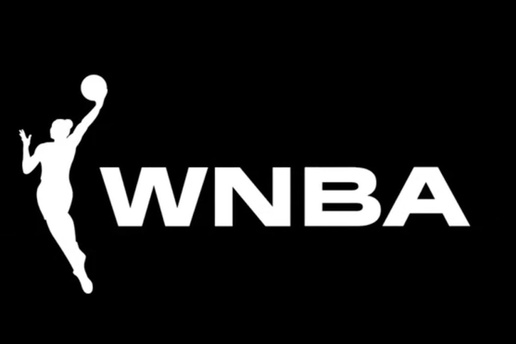
The WNBA still plans to use its incumbent logo for now with the new logo being featured more prominently starting with the 2020 season – a season that is still up in the year due to the looming CBA struggle sure to exist between the league and its players’ association.
Christy Hedgpeth, the W’s COO said to ESPN’s Mechelle Voepel that the reason why the new look is being debuted now was so it could give fans a better opportunity to purchase merchandise and get fans acquainted with the new look.
You can’t be culturally relevant without having cool stuff to wear. So we’re excited to build on our merchandise and work with our partners to reflect the brand in a lot of cool and exciting ways.
–Christin Hedgpeth, WNBA COO per Mechelle Voepel, ESPN
The plan looks to be to target the next generation of fans – millennials and Gen-Z’ers. Much talk has occurred in the past on how the WNBA has struggled with this group of fans.
Last year, the WNBA partnered with Sylvain Labs in an effort to work towards what was described at the time as “long-term growth” and “new marketing opportunities.”
Sylvain had worked with companies such as Google, Samsung, and Nike to find new and creative ways to market themselves.
Hedgpeth also mentioned that its logo is very different from others that are under the NBA umbrella. While the the logos of the NBA and the G-League are in a box, the WNBA’s new look is outside of said box.
In fact…there is none.
The box is going away. It’s powerful, it’s freeing and it’s expansive.
The new slogan…by the “way,” is just that…to “Make Way.”
Said slogan represents a number of things – including the ability of women inside and outside of sports to “make way” and become successful as well as a call to that same society at large to “make way” as well. Overall, the rebranding makes clear that the W plans to indeed build off of the feminist tone it embraced explicitly during the Lisa Borders years and take that to new heights.