It was announced not long after the 2024 WNBA All-Star Game in Phoenix that the 2025 version of the W’s midseason festivities would emanate from Gainbridge Fieldhouse in Indianapolis.
Clearly, the WNBA is continuing to attempt to capitalize off the increased attention that has been brought to the league thanks to the arrival of Caitlin Clark.
Prior to the announcement being made, we somewhat half-joked that the All-Star 2025 logo ought to be a silhouette of No. 22 given she is a major reason why Indianapolis got the nod for the first time.
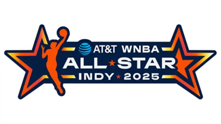
Considering what was officially put out there as the All-Star 2025 logo, we wished they would have simply gone with the Clark silhouette.
The WNBA and Indiana Fever recently released the All-Star 2025 logo – and to say it looks generic is an understatement.
A main selling point of the 2025 All-Star logo is that the blue, gold and orange gradients are supposed to capture the energy of basketball in Indianapolis not to mention the growing energy there is around the WNBA in general.
And while one can certainly feel the energy of that logo – to be honest it is a plus of said insignia – that appears to be the lone plus.
An All-Star Game logo is not only supposed to capture the energy of a city or an energy of a fanbase. An All-Star Game logo is supposed to let people know where the game is taking place.
If one were to look at this logo from afar, one probably could not tell at first glance that the game is even in Indianapolis. Where is a reference to an Indy landmark such as the Indianapolis Motor Speedway? Even a Hoosiers reference or an outline of the state of Indiana would have sufficed.
We are hoping that this is a one-off and not a sign that the WNBA All-Star logo is going to head in the same direction as the NBA’s has gone in recent years – generic with no pizazz and no charisma.
Look at the logos of the three previous All-Star Games – all of which us at Beyond The W have had the privilege of covering and we plan to be in the Hoosier State for the 2025 rendition. In 2022, the All-Star festivities took place in Chicago at Wintrust Arena with All-Star Friday happening at the McCormick Convention Center. One can tell that it was a Chicago All-Star weekend given the number of six-sided Chicago Stars it used not to mention the silhouette of the Willis Tower (Sears Tower) at the bottom.
In 2023, the scene for the All-Star Game shifted from the City of Wind to the City of Sin. One could automatically tell that the logo for the Las Vegas All-Star Game in 2023 was a Las Vegas logo. The use of playing cards and dice in said logo along with a shout-out to the world famous “Welcome to Las Vegas” sign certainly gave it quite the Vegas touch. The game took place at Michelob Ultra Arena – home of the Aces.
Last season, the WNBA’s All-Star festivities occurred in Phoenix at Footprint Center – home of the Mercury. Another top-tier logo was delivered. In fact, the Las Vegas and Phoenix logos both included references to how many previous All-Star Games there were prior those respective ones. The three mountains in the center of Phoenix’s logo even were a reference to there being three All-Star Games throughout the W’s history that have taken place in the Valley of the Sun. Again – a logo that screamed “Arizona.”
We are sorry, but we cannot see anything “Indianapolis” or “Indiana” about this insignia other than the Fever’s blue, gold and red colors. It looks vanilla – the way logos for the NBA’s All-Star weekend have become as well as those of the Super Bowl. It is the type of logo that could legitimately be duplicated for any All-Star weekend in any city.
All one has to do is substitute the team colors. Think black and seafoam for an All-Star weekend in New York or red, white and blue for an All-Star weekend in Washington, D.C.
Ultimately – it is only a logo and a subpar logo will not take away from what should be another exciting All-Star weekend – the first one to ever take place in the Hoosier State.
But so much of sports is branding. And when a marquee event for a league like the WNBA has a brand that looks more vanilla than unique, it is not a good look.
Let us hope that this is a mere bump on the bricks as opposed to a spinout in turn four at the Speedway.


