
For many years, it appeared that the WNBA was perpetually stuck on 12 franchises before a wave of expansion engulfed the league.
First, it was the Golden State Valkyries. Then arrived the 2026 season which also happened to be the W’s 30thanniversary. This season has seen the relaunch of the Portland Fire as well as the emergence of the WNBA’s first-ever team in Canada – the Toronto Tempo.
WNBA commissioner Cathy Engelbert notably set an ambitious goal of an 18-team W. That accomplishment will certainly be achieved considering the emergence of franchises in Cleveland, Detroit, and Philadelphia throughout the remainder of the decade.
One question that, of course, follows every expansion franchise is what the names of said franchises will be. Also, what will be the franchise’s colors?
The official WNBA Cleveland account began putting out teasers on its social media indicating that the announcement would be made on August 4. Those posts put particular emphasis on blue. In addition, the #HearTheCall hashtag was a strong clue.
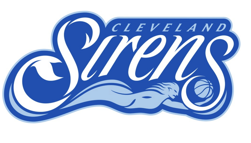
On August 4th, it was revealed at an event at Rocket Arena that the name of the WNBA’s franchise for The Land would be the Cleveland Sirens. Janice Braxton, a former Cleveland Rocker, voiced the Sirens’ introductory video.
We at Beyond The W have initial musings on the reveal of Cleveland’s team name and logo.
Ohio’s Franchise
In many ways, the rollout is similar to that of the Toronto Tempo where it is embracing all of Canada. One may have noticed on the Sirens’ Instagram feed references to “hearing the call” in various Buckeye State locales such as Cincinnati, Columbus, Toledo and, of course, Akron – the birthplace of someone named LeBron James.
One place where the call likely is not being heard is in Detroit which is set to take the court in 2029. Ohio sports franchises almost always have rivalries with Michigan franchises and the Sirens will have a geographical rival in Detroit in three years.
Rock Entertainment Group
The Cleveland rollout did an excellent job incorporating other entities within the Dan Gilbert-owned Rock Entertainment Group – including flagship entities such as the Cleveland Cavaliers and Rocket Arena itself.
The irony of the organization is that it has its headquarters in Detroit.
If one looks on the Rock Entertainment Group website, it has already been updated to reflect the Sirens as being under the REG umbrella.
One entity of the Rock Entertainment Group is the Rock Entertainment Sports Network which is managed by REG and owned and operated by Gray Media. Our guess is Sirens contests will be aired on RESN in addition to having games carried locally on WOIO-TV and WUAB-TV – Gray’s two Cleveland stations.
Valkyries Vibes
If one catches how the Sirens’ rollout was executed over the last several days, it had plenty of similarities to how that of the Valkyries was done prior to its debut.
Instead of taking to the Bay Area’s skies as Golden State did, Cleveland decided to get its inspiration for its insignia from Lake Erie – a defining feature of the Cleveland area.
Color Scheme
There are several WNBA teams that have some shade of blue as part of their logos. Those include the Minnesota Lynx, Dallas Wings, Indiana Fever, Atlanta Dream, Washington Mystics, Chicago Sky and Connecticut Sun.
When the Sun relaunch as the Houston Comets beginning in 2027, navy blue and red will be the signature hues of the newly christened Comets as was the case with the original Comets franchise.
A team having multiple shades of blue certainly make it stand out from the pack. Those hues of blue should also ought to display well on jerseys and other merchandise.
Logo
The primary and secondary logos for the Sirens are intriguing because “Sirens” is not exactly in script but is as close as one can get to being in script.
WNBA logos have certainly evolved over the years. The only team currently with script as part of its primary logo is the Indiana Fever. The Phoenix Mercury used to have a script logo but changed its familiar logo prior to this season.
The Sirens already have a strong case for having, perhaps, the sleekest logo of any WNBA franchise. This is more than fitting considering said logo is aquatically influenced.