Just as the WNBA debuted an updated set of uniforms for its 25th anniversary, the W and its partner Nike has done the same for year number 30.
The concept of the Rebel Edition jersey was first introduced for the W’s 25th anniversary. This was in 2021 when the WNBA not only celebrated year 25 but was beginning to emerge from the pandemic after its bubble year of 2020. The 30th anniversary is also featuring Court Origins uniforms for the New York Liberty, Los Angeles Sparks and Phoenix Mercury (no Las Vegas Aces?).
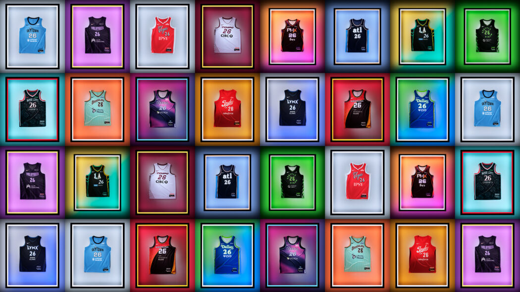
Rebel Edition jerseys are basically the equivalent of “City Edition” or “City Connect” threads that are used by other leagues such as the NBA and MLB. Here is our review of all 15 WNBA Rebel Edition threads.
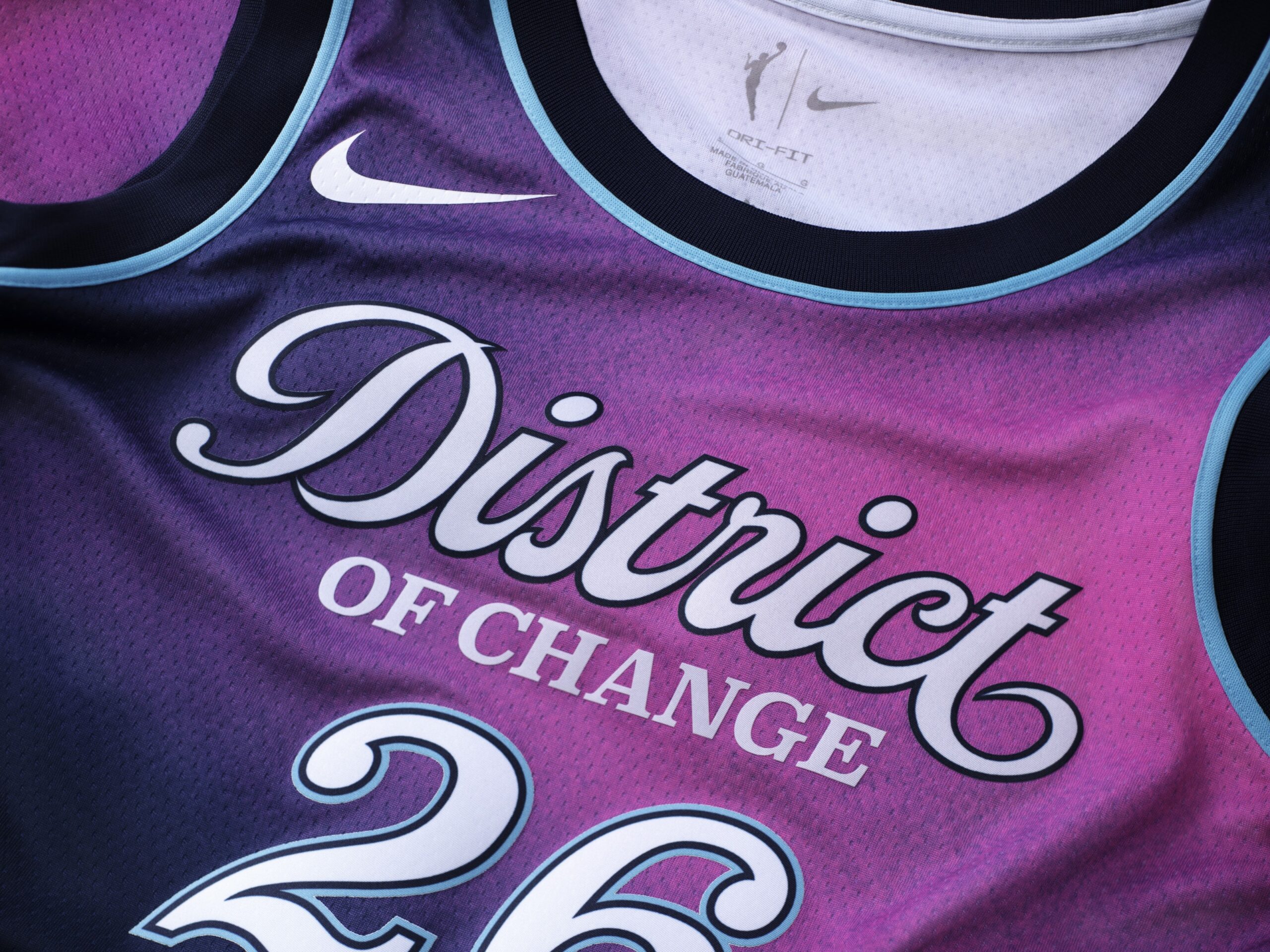
In our humble opinion, the Mystics won the Rebel threads battle this season. The words “District of Change” embroidered on the top of the uniform is important especially given the current political climate.
According to the team, these threads pay homage to Washington’s U Street neighborhood which was previously known as Black Broadway and how women were instrumental at the heartbeat of its cultural identity.
In addition to the Mystics’ signature blue, another color prominently seen is Laser Fuchsia. The team says these threads will be worn on seven occasions this season with the first being an upcoming contest with the Los Angeles Sparks later this month.
For a team whose initial set of Rebel uniforms in 2021 landed the Wings in public relations quicksand with its progressive fanbase, the Wings understood the assignment this time.
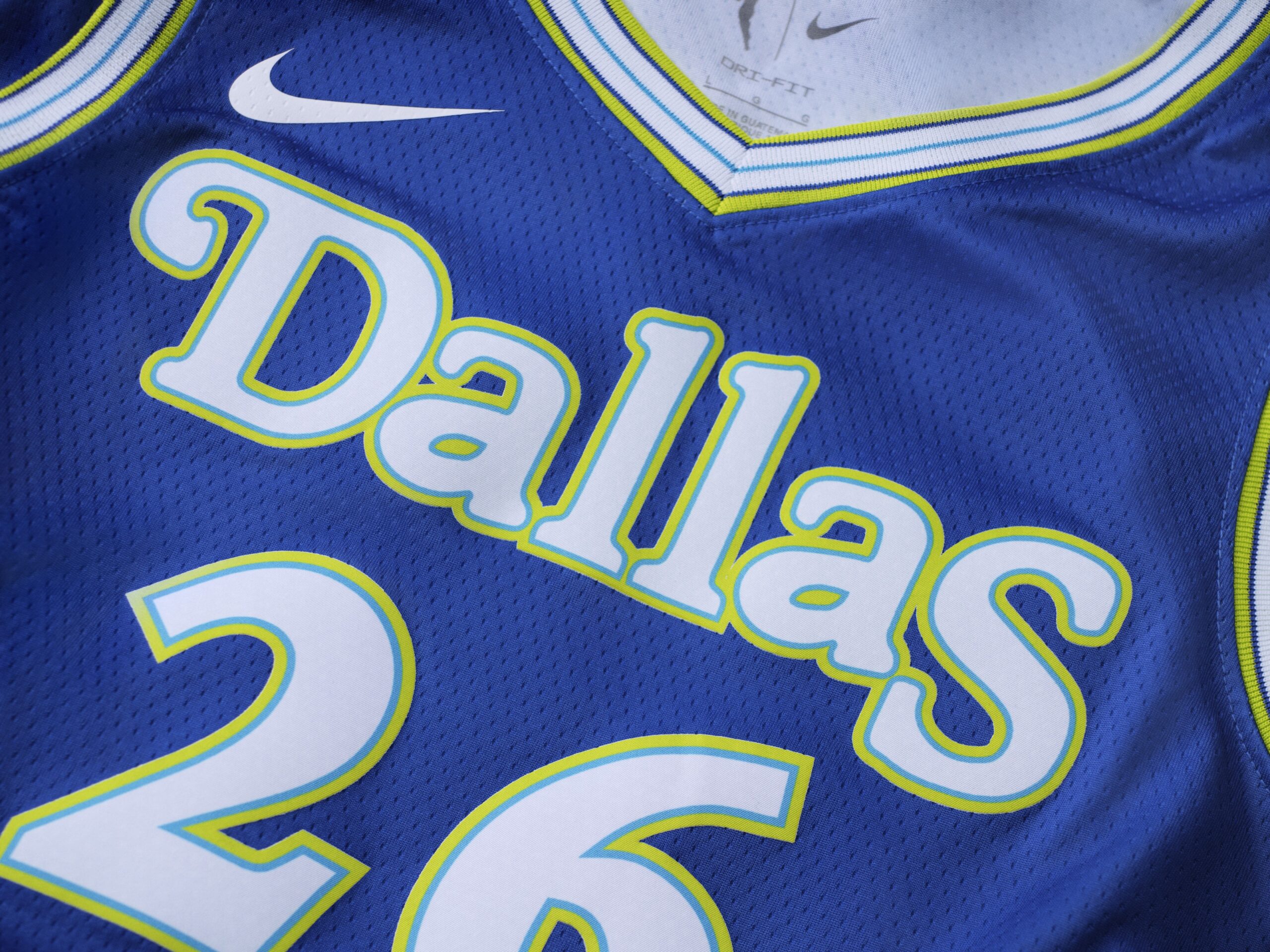
Remember the Dallas Diamonds? That was a team that was part of the Women’s American Basketball Association that was in existence for only one season – 1984. The lone champion of the WABA? The Dallas Diamonds who once had Nancy Lieberman as the centerpiece of the Diamonds.
The Wings have already worn its Rebel threads once this season – and shined bright like diamonds. Dallas defeated the Indiana Fever by a final score of 109-107 in a contest that the WNBA is already touting as having been seen by 2.5 million viewers.
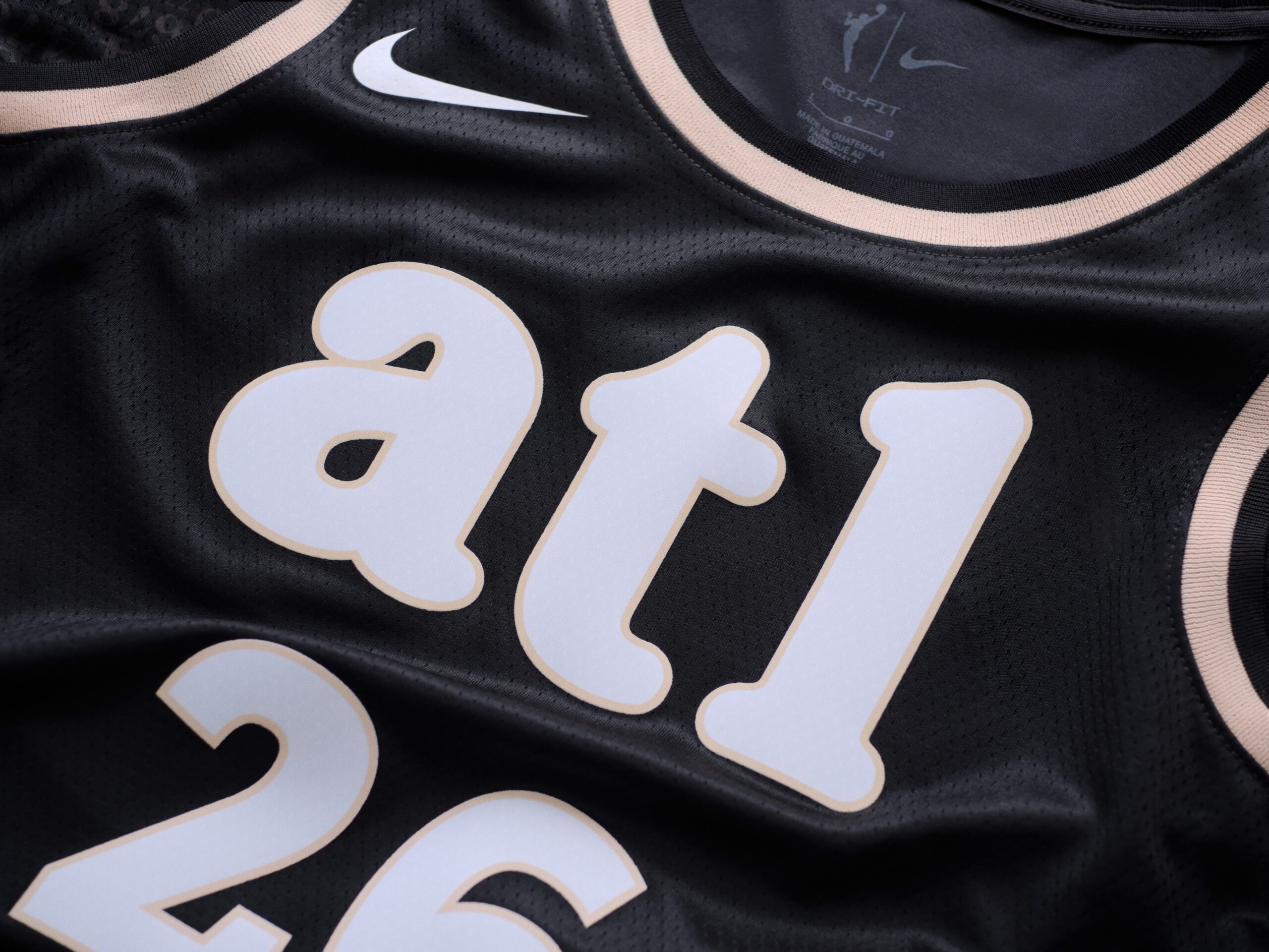
The Dream is touting its Rebel uniforms as its “Homegrown Jersey.” Atlanta has been one of the better teams over the years at the Rebel uniform game and it has done so again.
For Atlanta’s Rebel uniforms, it is all in the details. It includes an “A” Peach logo which is…so ATL. Peach is also a prominently featured color on said Rebel threads. The blue color is also a nice touch as the franchise mentions how it is a throwback to the Dream’s origins.
The most impressive detail, in our opinion, of these Rebel uniforms is it includes Atlanta’s area codes – such as 404, 678 and 770.
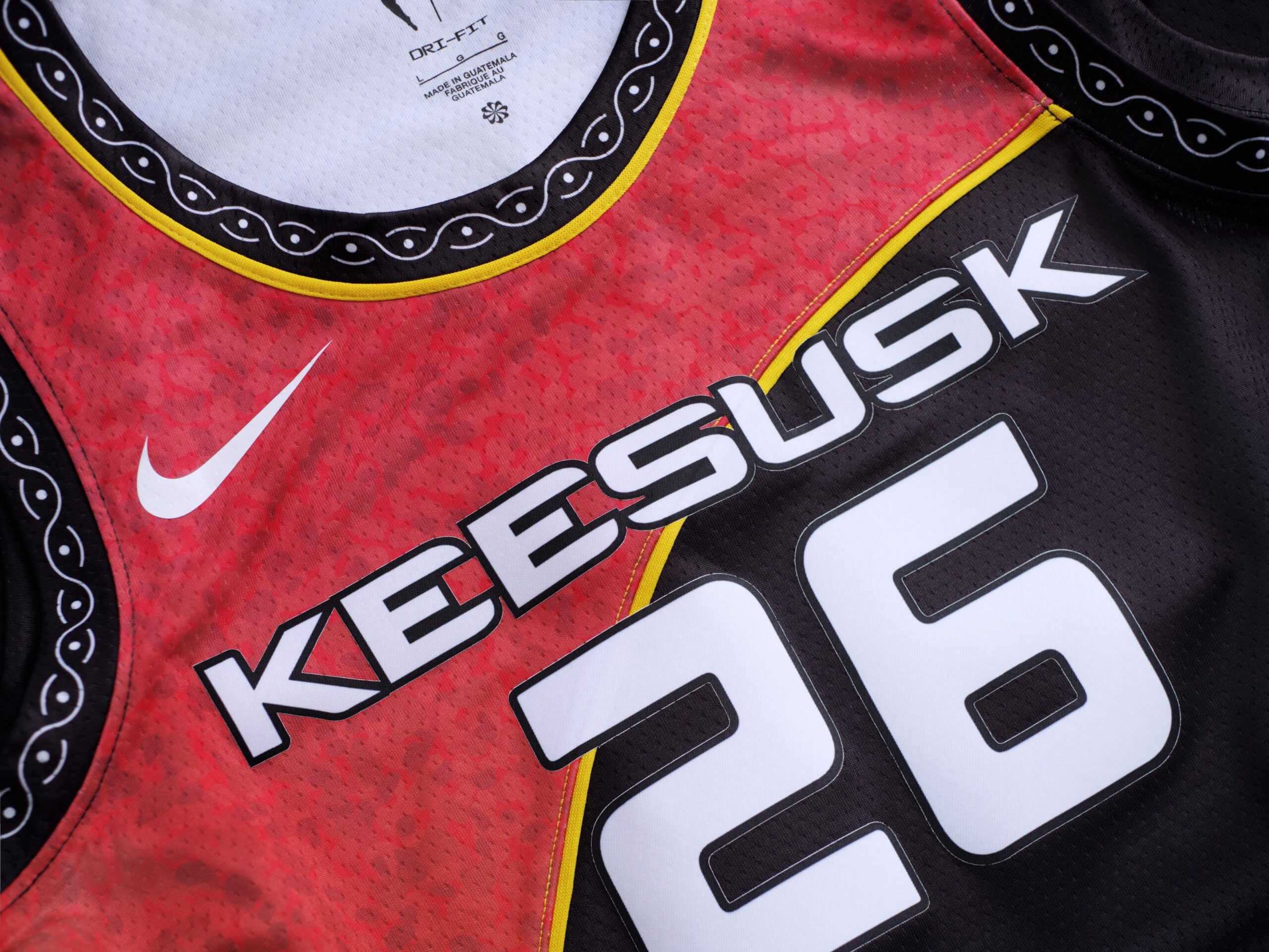
When the Rebel uniform concept first was introduced to the WNBA in 2021, the Sun had a unique concept with an all-blue uniform with “Keesusk” at the top. Keesusk is the Mohegan word for sun.
Connecticut’s Sunset Season will feature its third and final Rebel Edition jersey before the Sun are relocated to Houston beginning with the 2027 season. According to the team, these threads pay homage to the connection between the team and the Mohegan Tribe.
The theme of Connecticut’s threads centers on the concept of honoring the past while carrying the legacy of the team forward. The Sun have already worn these uniforms once this season when the team hosted the Seattle Storm. Seattle defeated Connecticut by a final of 89-82.
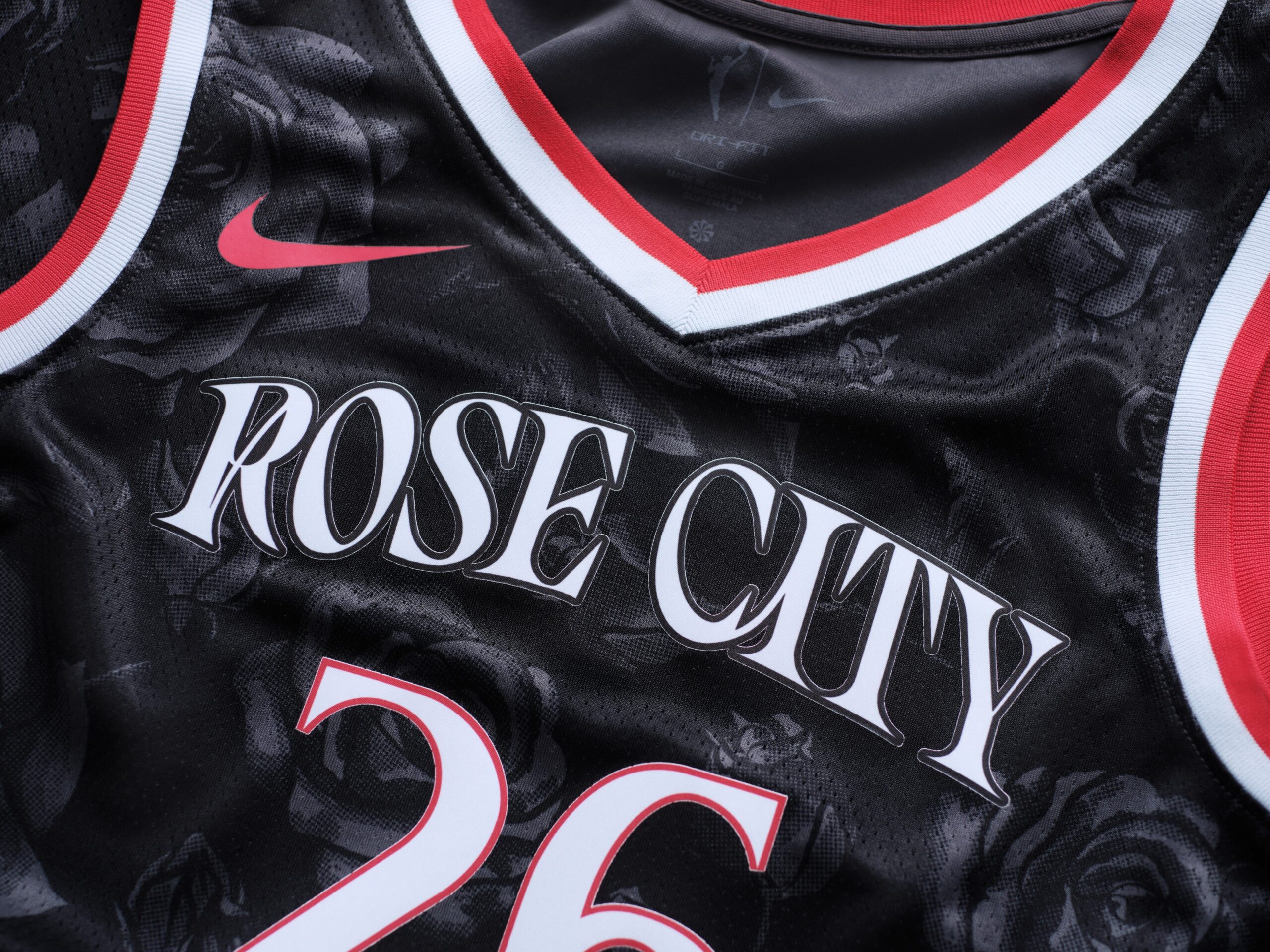
With this being the first season that the Fire are once again a WNBA franchise, many a fan throughout Oregon has plenty of intrigue as to what the Rebel threads for this team would resemble.
As expected, Portland already leaned into the fiery rose concept with its new logo and it once again paid homage to Rose City with the detail of its Rebel uniform.
The re-launched Fire have been in the news as of late because of a walk-off putback layup by Sarah Ashlee Barker to earn Portland its first win – and it was against the New York Liberty of all teams.
Speaking of the Liberty…
When the initial set of Rebel uniforms was introduced in 2021, New York – in vintage WNBA fashion – placed emphasis on “Equality” with its first two sets of Rebel threads.
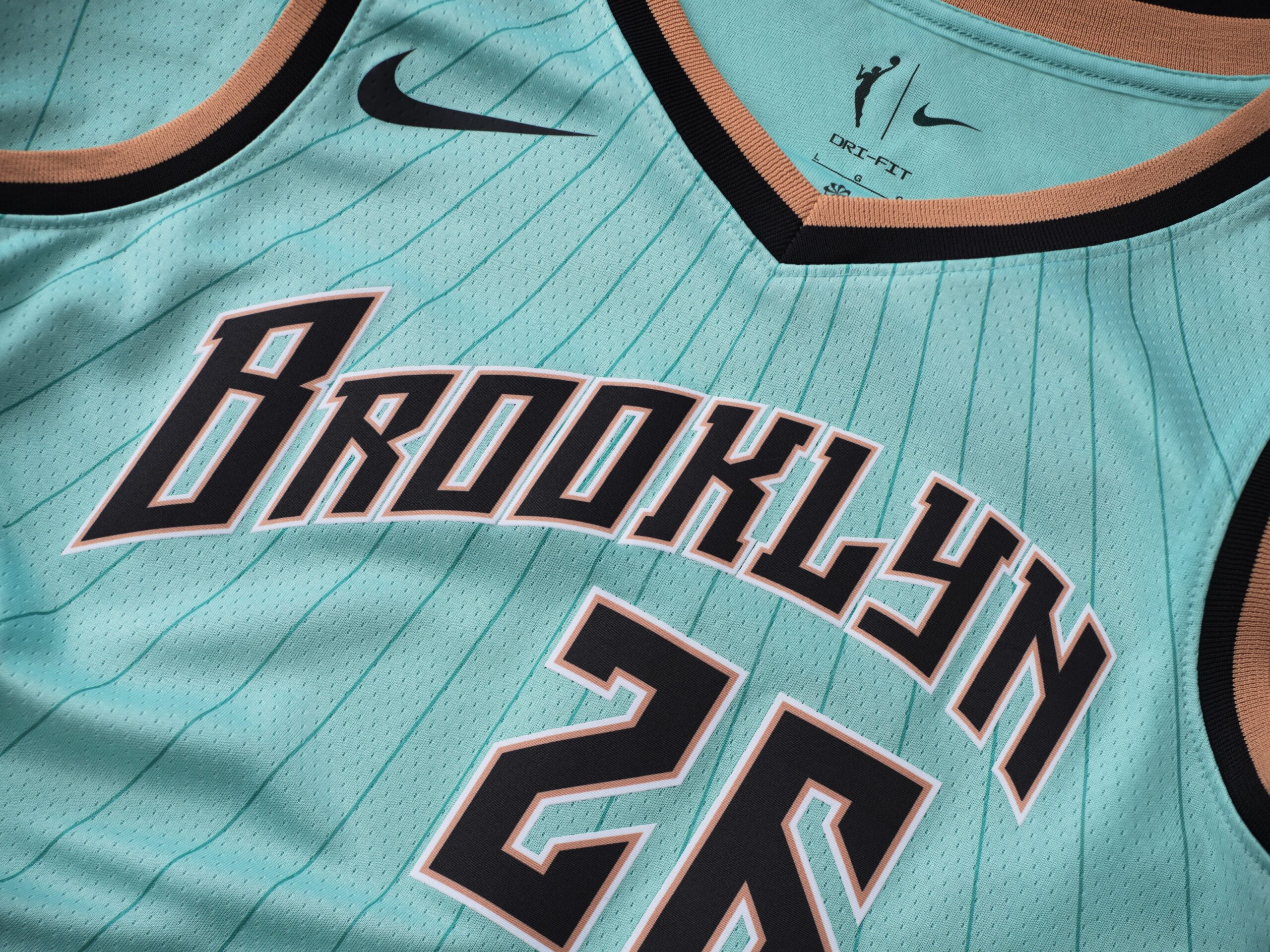
These updated Rebel uniforms are more an homage to the Liberty’s base in Brooklyn and once again emphasizes its seafoam color that has been at the heart of the franchise’s identity dating back to its Madison Square Garden days.
This is another where it is all about details as the uniform includes tributes to the Brooklyn Bridge and its Manhattan roots. It also includes a quote from Emily Warren Roebling who played a pivotal role in the bridge’s construction.
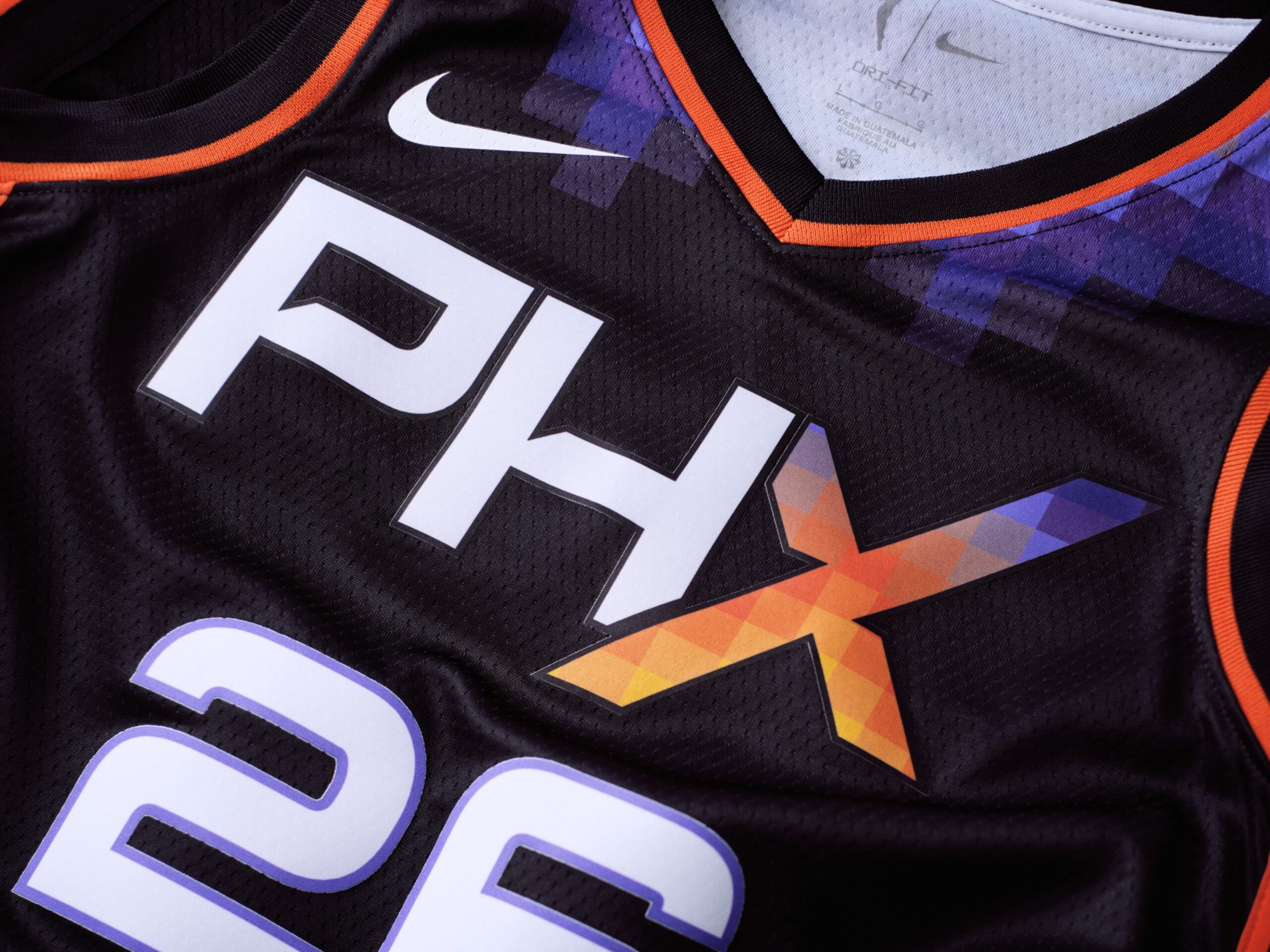
A year after reaching another WNBA Finals, the Mercury have undergone a complete rebrand. That is not only present with Phoenix’s newer and more simplified logo.
It is also present in the Mercury’s updated Rebel threads. Phoenix is another franchise that has now featured three Rebel uniforms throughout its history.
As expected, it features the recognizable orange, yellow and purple Valley gradient on the “X” in PHX – a nod to its X-Factor which is one of the most passionate and loyal fanbases in all of sports. Not only did the Mercury unveil new Rebel Edition uniforms, it also unveiled a Rebel Edition court.
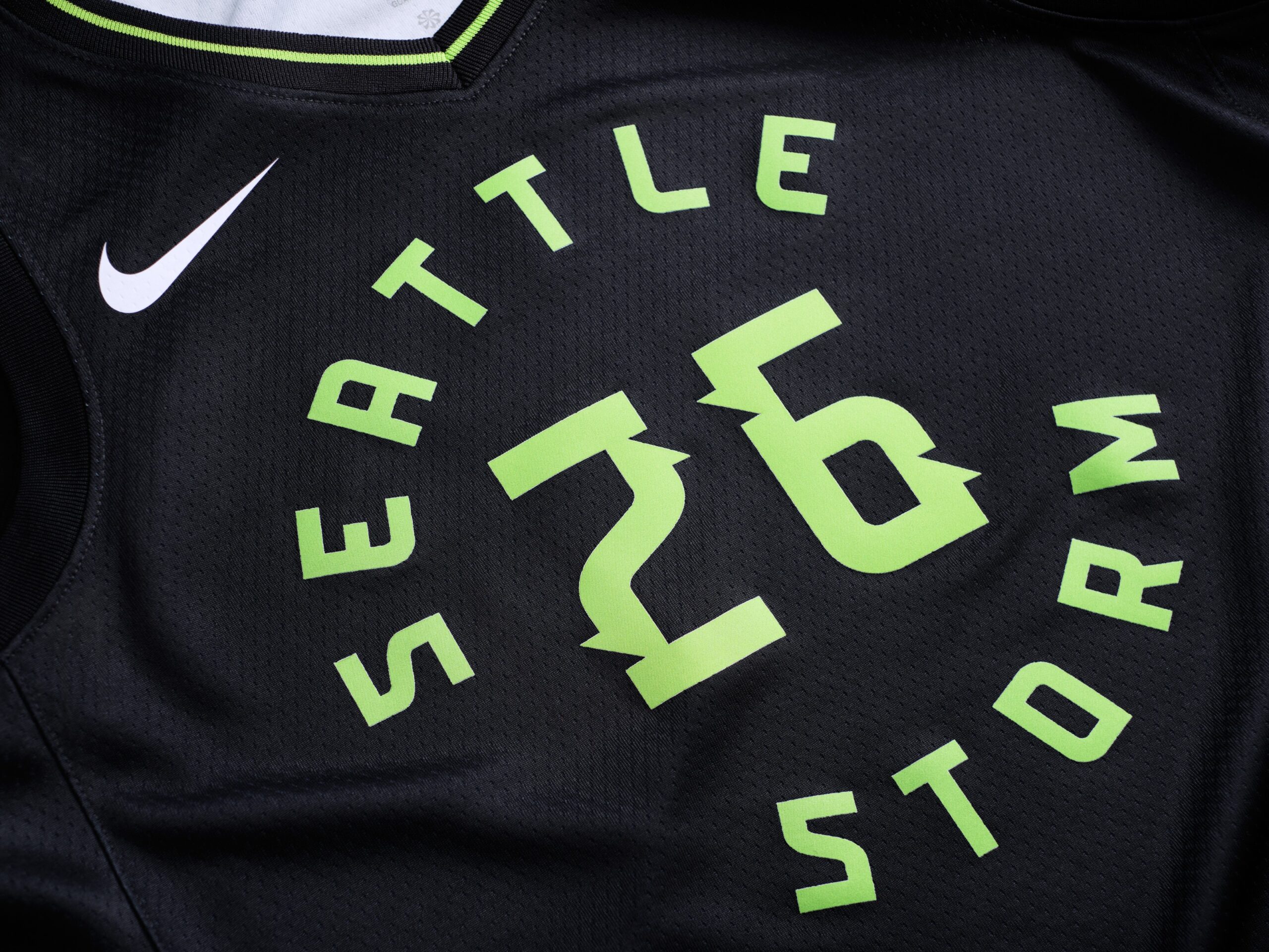
The Storm had one of the more impressive Rebel uniforms when the concept was first introduced in 2021 as Seattle paid homage to its city’s culture. Those 2021 paid a nod to Seattle’s identity as being the grunge rock capital of our planet.
Seattle is once again leaning into its black and neon green colors with this version of its Rebel fit. The team says that the circular scheme for its jersey logo is similar to that of an oncoming storm.
There are also lightning patterns on the sides and cloud formations on its insides – such as those of an oncoming storm. Seattle has already worn this uniform once – when it hosted the Golden State Valkyries on opening night.
Speaking of the Valkyries…
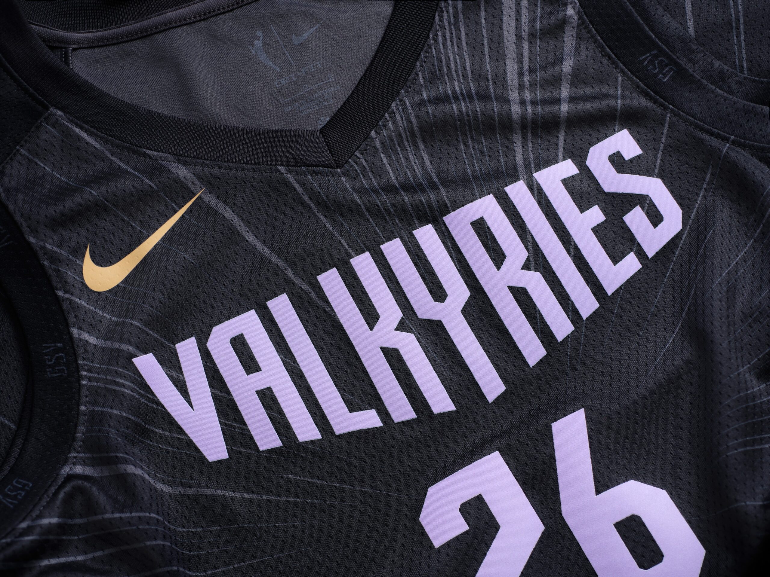
From a distance, when one observes Golden State’s Rebel uniform, it looks like a typical black uniform that happens to have “Valkyries” at the top.
But this one also places plenty of emphasis on detail. Notice the gold waves at the bottom? That is textbook Bay Area.
In addition, the lines that emanate from the jersey’s center are “lasers” according to the team. That is an homage to the San Jose Lasers of the old American Basketball League that existed just prior to the WNBA’s debut in 1997.
Interestingly enough, black was the predominant color for Golden State’s Explorer jersey last year but the Valkyries’ Explorer jersey is violet this season. So far, the Valkyries have picked up where they left off last season as they have won their first two games as of this writing.
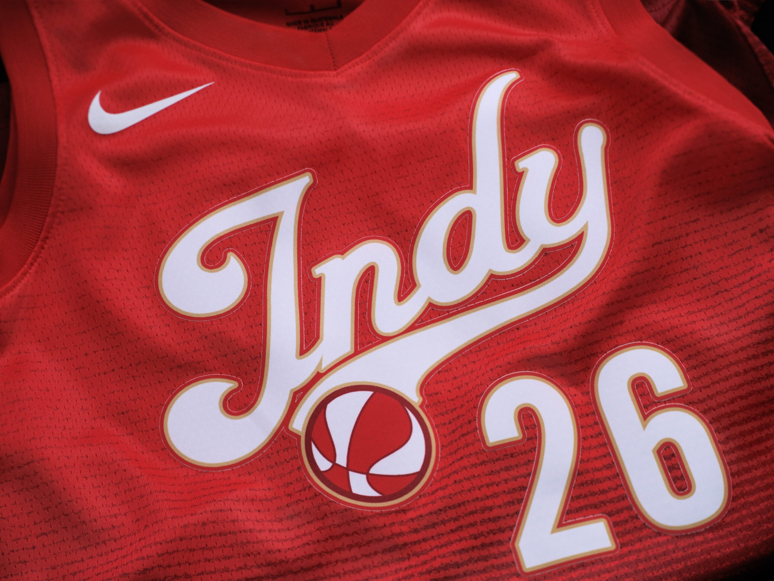
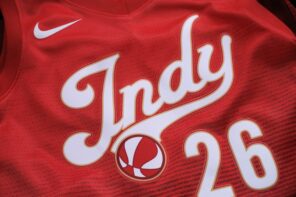
Red, gold and navy blue are the signature colors that define the Indiana Fever. This is a franchise that is no stranger to unique Rebel Edition uniforms as it once had a jersey in collaboration with Stranger Things – the hit episodic program on Netflix.
This time, the Fever went a bit simpler with its latest Rebel uniforms – a red jersey with “Indy” at the top in the signature Fever script font.
Indiana wasted no time debuting these jerseys on the court. The Fever wore its new red Rebel fits in its season opener against the Dallas Wings at Gainbridge Fieldhouse.
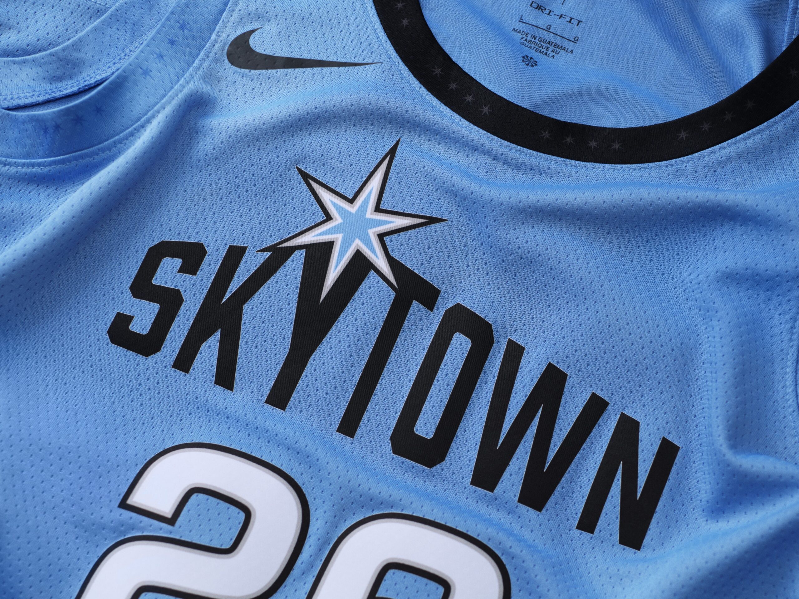
The Sky have always placed emphasis on its signature Sky blue for its Rebel edition uniforms. This dates back to its initial Rebel fits that gave the impression of a frigid Chicago winter.
Chicago decided to go a bit simpler with its Rebel fits this time. It still has Skytown across the top of the jersey but places more emphasis on the six-sided star – the primary symbol of the city.
One detail that caught our attention was the inclusion of 77 stars. How many neighborhoods are there in Chicago? There are 77 – with a 78th being constructed that is garnering plenty of attention around the area.
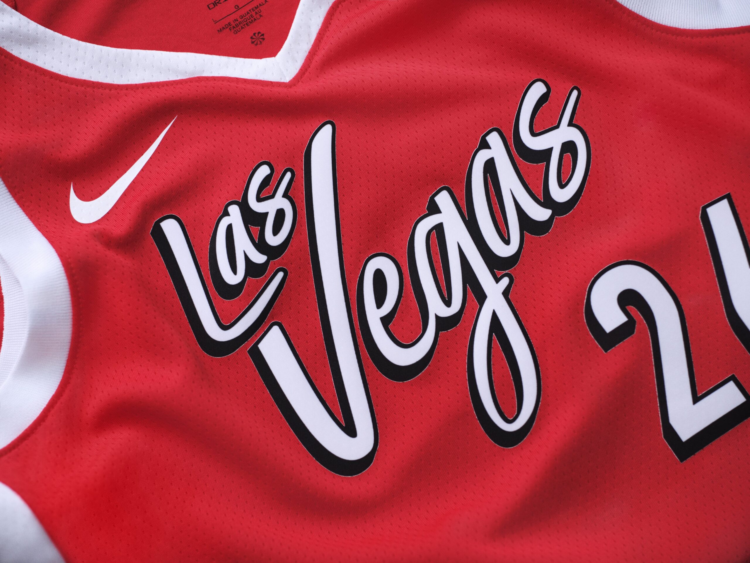
Since the Aces’ rebrand, Las Vegas has not placed as much emphasis on red as it used to but it is still a color that the Aces utilize every now and then.
These last few Rebel threads did not exactly have much detail. The Aces’ updated Rebel fits are simply are red uniform with “Las Vegas” at the top. The team is referring to the red as “Sin City red.”
We remember the initial set of Aces rebel uniforms that were more black and gold – plus the more recent variation of those threads that put more emphasis on that red color.
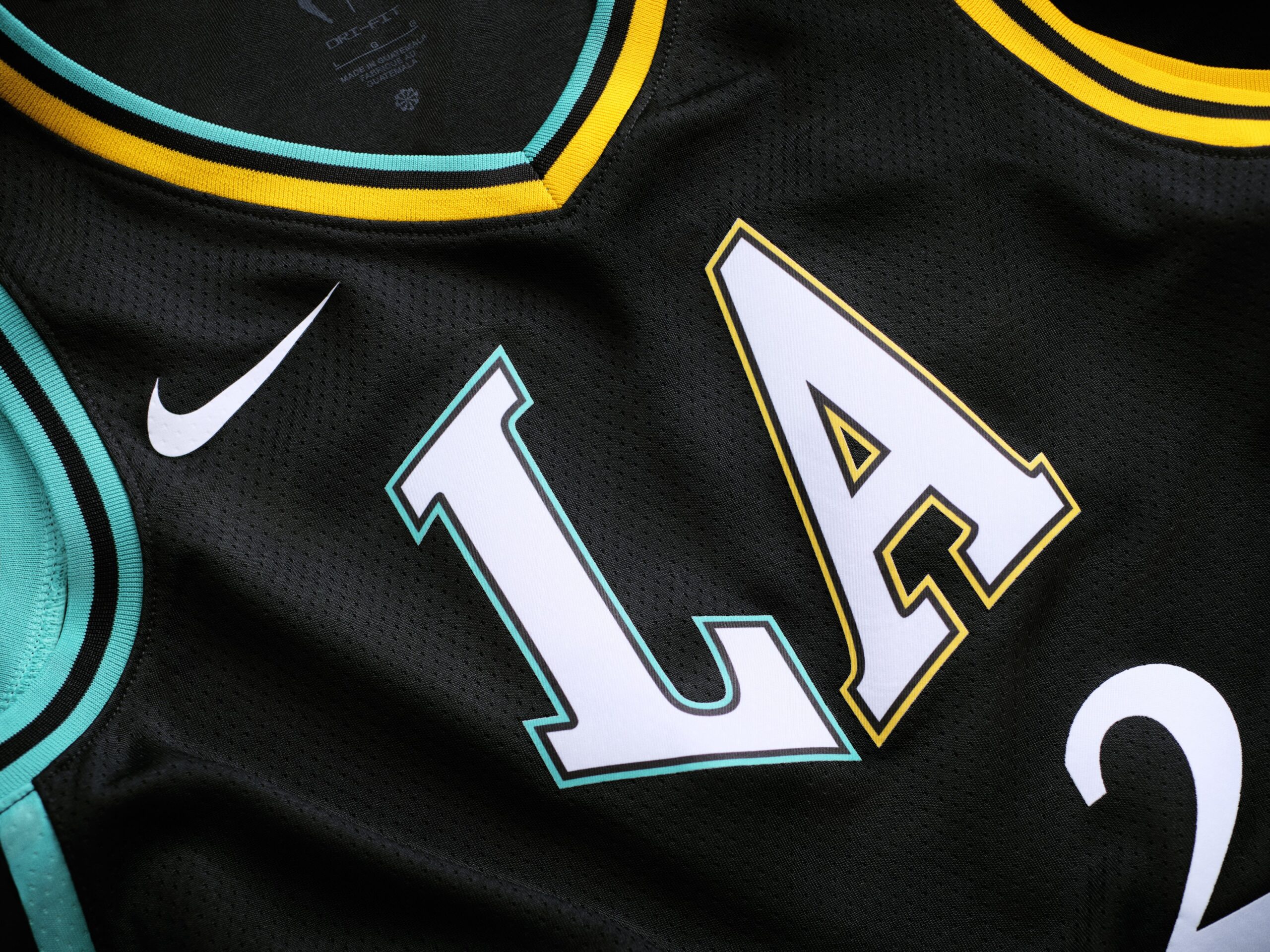
When we first noticed what the Sparks’ 30th anniversary Rebel uniforms would resemble, it caused a bit of a head scratch.
Imagine the Sparks wearing these uniforms – in a game against the New York Liberty wearing its black Explorer edition threads. They look very similar.
What makes them similar is the inclusion of teal which is not all that far removed from Liberty seafoam. Teal is a Sparks color even if it has not been as emphasized over the years as gold or purple. This is certainly different from the Sparks’ initial black and gold Rebel threads or the more recent gold and purple uniform.
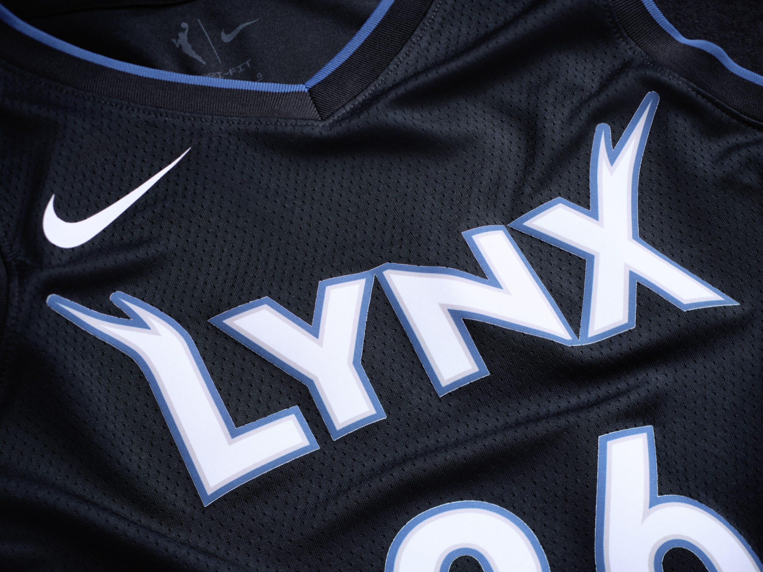
The Lynx’s new Rebel jerseys appear to give off the impression of a “nocturnal hunt” in the Minnesota wilderness.
It centers more around the “Don’t Blink” theme and the team says it places emphasis on strength while other teams opt for flash in their Rebel uniforms.
Minnesota wasted no time debuting its new Rebel jerseys on the court. The Lynx wore its fit for its season (and home) opener against the Atlanta Dream. All three of the Lynx’s Rebel jerseys throughout their history have been black jerseys but this one emphasizes more black with a touch of blue where the initial Rebel was black and white and the most recent put more emphasis on shades of green.
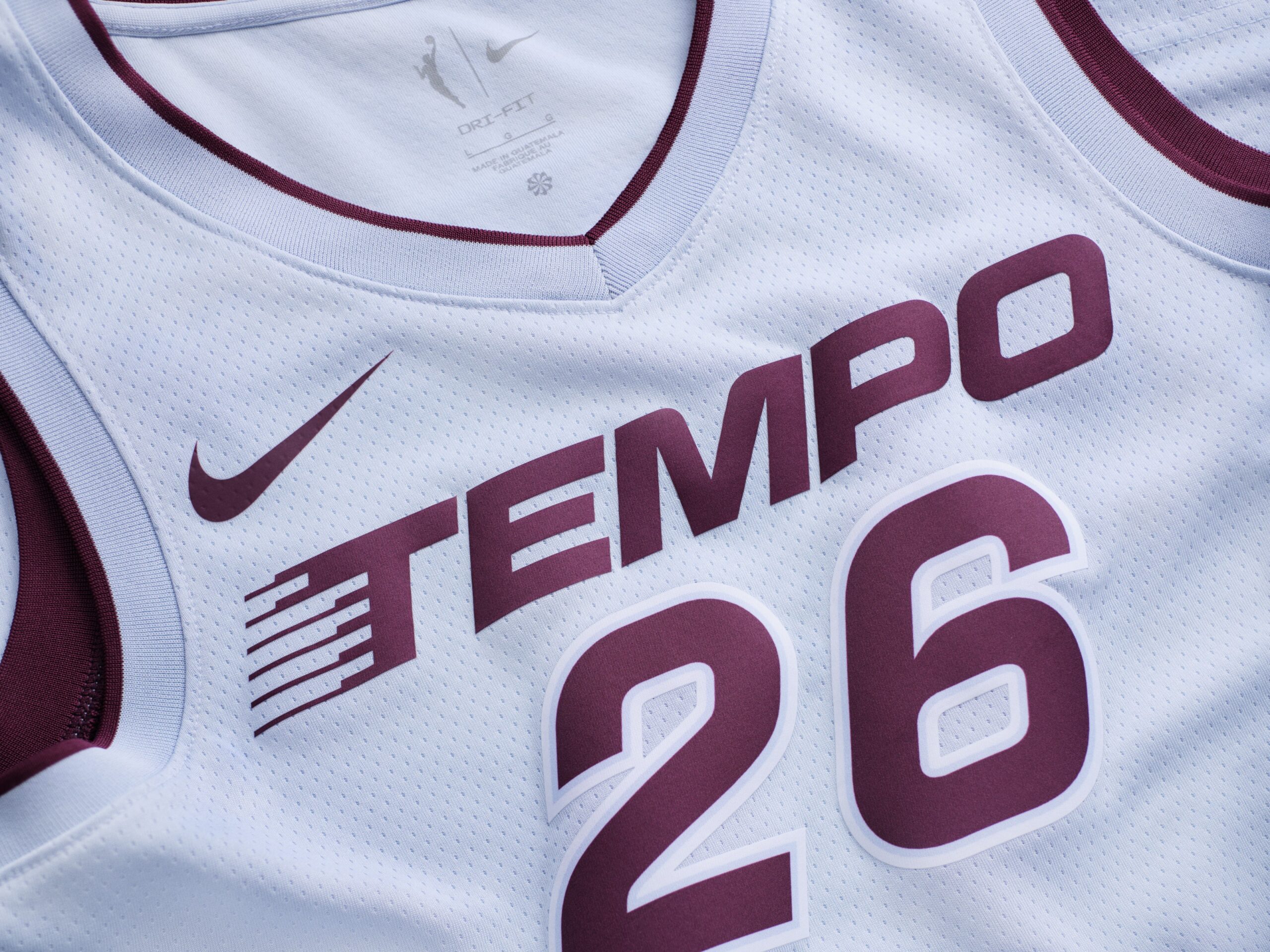
The Tempo refer to its primary colors as Bordeaux and Borealis Blue. The approach Toronto has taken with its initial set of uniforms takes us back to what was the case with the Connecticut Sun during the WNBA’s 25th anniversary.
Nothing too flashy or out there – simply an emphasis on team colors. The Heroine jersey is white and the Explorer threads are Bordeaux. It makes sense that Borealis Blue would be the chosen color for the Tempo’s Rebel uniform in its inaugural season.
While the Tempo have placed more emphasis on its Bordeaux Explorer jersey, The Borealis Blue Rebel certainly is a well-rounded compliment to the Explorer and Heroine editions given the Tempo’s color scheme.